
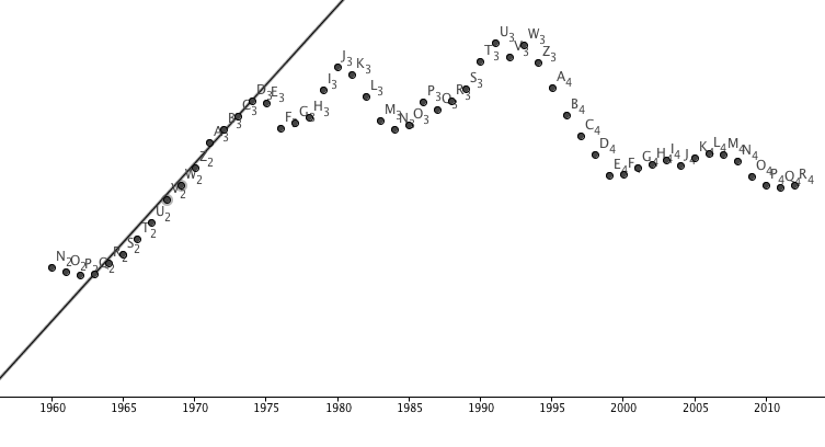
The Mathematical Project was about different linear and non linear equations that are actually happening in this world and how Cartesian planes can prove that. We also got partners that were in the same exhibition group as us because the entire linear and non linear graphs had to be somewhat relative to our exhibition. Our exhibition was on Yemen and since Yemen as we know it is a third world country we decided to go with crime. The #1 country with the most crime is the United States believe it or not so we decided to do the linear and non linear graphs on the murder rate from around the 1960's to present time. Both the Linear and Non Linear were in the same line graph because we had so many years go by on our line graph enabling us to choose both on the same graph. How we obtained all of our data on the U.S. murder rate is we went to this website: http://www.fbi.gov/about-us/cjis/ucr/crime-in-the-u.s/2011/crime-in-the-u.s.-2011/tables/table-1. This website had all the information we needed and we even found more years on the website.
|
|
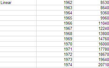
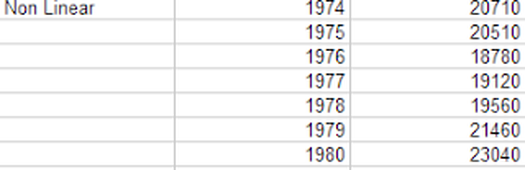
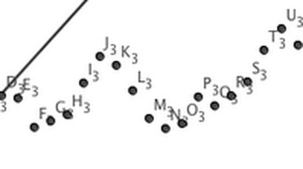
Now for the first Linear Graph I believe this is linear because based on the In/out tables for the linear graph it shows completely how it is linear (not exactly) but it has no rapid jump in order to make a wavy pattern. By just looking at the linear graph you could tell right off the bat that there is some sort of linear relationship creating the straight diagonal line. Now for the Non Linear Graph there is no correlation between the numbers and if you tried to make a line there would be no possible way. Even trying to make a line of best fit is not possible because of how the wavy formation is on the graph. Even look at the numbers on the in/out table and you could not mathematically predict what is going to happen between those years.
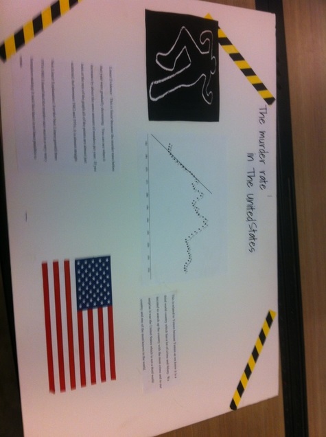
The motivation for this piece was since our information surrounded the topic of murder and not just crime in itself in The United States, we decided to go for the crime scene kind of look to make it look appealing and show what the whole topic is about in the first place. What went well for our project is that we were able to find information on our murder rate very easily since the FBI wants to share that with the public so that it's aware. Another fortunate event that was successful is that we were able to find our Linear and Non Linear Graph on the same blown out scale graph since the graph was so big. What didn't go so well and what we should have done is potentially show how this relates to Yemen since a lot of people didn't understand the whole correlation. We should have had a description explaining how they both correlate with each other. One habit of a Mathematician that I basically had to use was looking for patterns because that is how we were able to see which points were going to be linear based on the in/out table. We didn't even have to create a graph and by just looking at some of the years we were able to see if they had some sort of linear pattern. A Habit we didn't use but should have used is to not divide and conquer because what ended up happening was I was doing the Linear section of the graphs and my partner was doing the non linear part and once we tried to collaborate we had no idea what we were both talking about
